Customology Website Portfolio
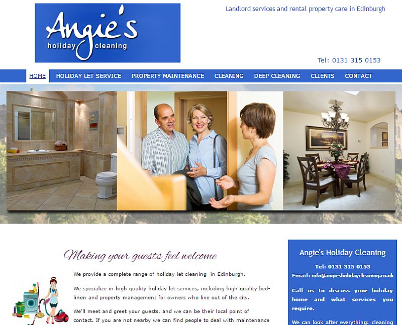
The Business & Website Before Rebranding
Case Study: A Business Rebrand
Click here for the new business website if you just can’t wait!
Angie Reid’s business is in providing a premium property management service for owners of holiday let accommodation in Edinburgh.
At the time of writing (April 2017) she manages nearly 50 properties for over 40 different clients. They are all quality properties and range from one bedroom Victorian apartments in the centre of the city, to 4 bedroom homes in the suburbs.
I have known Angie for around four years now, after being introduced by a mutual acquaintance.
When we first ‘met’, (we have only ever spoken on the phone), the business name was Edinburgh Cleaning Services. However there was apparently another business with a similar name, so a while later she changed the name to Angie’s Holiday Cleaning.
When we got back in touch again, after a couple of years of not speaking, she mentioned that she had been thinking of updating her most recent website – and asked if I could help.
The first thing that struck me was that the current business name did not reflect the quality and breadth of her services – and was almost certainly affecting the perception of her business.
I suggested we needed to take a wider view than just updating the website – and she could see the value in this.
NB. It is not common place for me to suggest a name change when working with a business, usually we would stay with the current name. An update of the logo is something that happens more often.
A New Name For Angie’s Holiday Cleaning
Pre and post let cleaning is a big part of their service, but Angie and her experienced team can also; be the point of contact for guests before they arrive, meet and greet them at the property, and then be an emergency point of contact throughout their stay.
They can also deal with any maintenance issues that arise, or even provide a complete property management service for any owner that lives away from the city, or doesn’t wish to be involved in the day to day management of their property.
It was this breadth and flexibility of services that led me to the word concierge – a term that is used more these days as a high end service in helping people to manage every aspect of their day to day lives. Cleaning remained because this is something they have always been known for and they would like to expand more into the domestic cleaning market too.
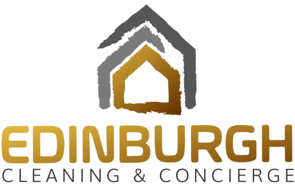
And so the new name for Angie’s Holiday Cleaning became Edinburgh Cleaning and Concierge. (I did consider adding Services to this, but it would have made the name too long. However we do use the term often on the website),
Once we had the name, the next step was creating a logo and choosing a core colour scheme for the business.
I wanted something that was clean and contemporary, not fussy and over complicated. Something that would look good on a business card and other stationery too. And I came up with two slightly different variations.
Creating A New Website For Edinburgh Cleaning & Concierge
The purpose of the website is to highlight the quality and professionalism of the business and in doing so encourage prospects for the service to get in touch and find out more.
The design of the Home Page is unique from the other pages within the site, which do all have the same consistent design.
When viewed on a desktop or tablet it opens with a clean, full width screen with the page navigation bar appearing upon scrolling.
It has all the information needed for the visitor to get a good ‘first impression’ about the business and its services. This includes an outlining of its core services, testimonials from clients and guests, an introduction to some of the key members of staff (which helps to form a connection with the business before they even contact them), a Contact Form and full Contact details.
The Contact Form and contact details are actually present on the bottom of every page throughout the site because we want to make it very easy for the visitor to make an enquiry, whenever they’re ready to do so.
As already mentioned, the other pages within the website are styled differently from the Home Page, but they do all share the same consistent design and layout.
They also have a variation of the logo design in the header section at the top of each page. It’s a horizontal version of the original, with a shadowing effect so it stands out more on the image background.
The website overall is created in what is called a ‘responsive design’ which automatically adjusts itself to appear on all different devices, from desktop PC’s to mobile phones – and everything in between.
This is the way it has to be now with more people viewing on mobile devices and Google having a “mobile first” policy in its recognition of the best quality websites.
The New Website After Rebranding
However, no matter how good the latest technology, it’s virtually impossible to have a website that looks and functions great on all devices, without some modifications.
On this website there are several sections which have been created with different versions for desktop and mobile viewing. And tablet viewing is slightly different again – which means that the new Edinburgh Cleaning & Concierge website is not really just one site, but actually two or three.
Click here to see the website live on your current device – and please do get in touch if I may be able to help with attracting new customers and growing your business in any way.


