Customology Website Portfolio
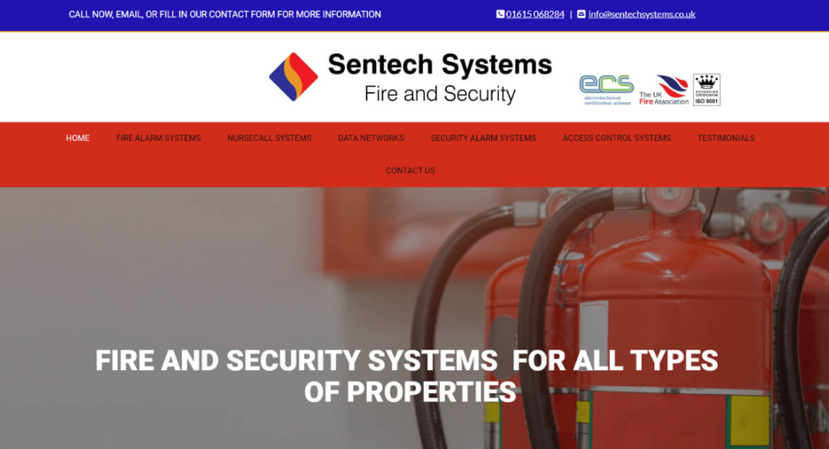
Previous Website
I was recommended to the business owners. Mike & Lee, by Martin Crossley the owner of Hollingworth Fire Systems, who I created a site for at the beginning of 2023!
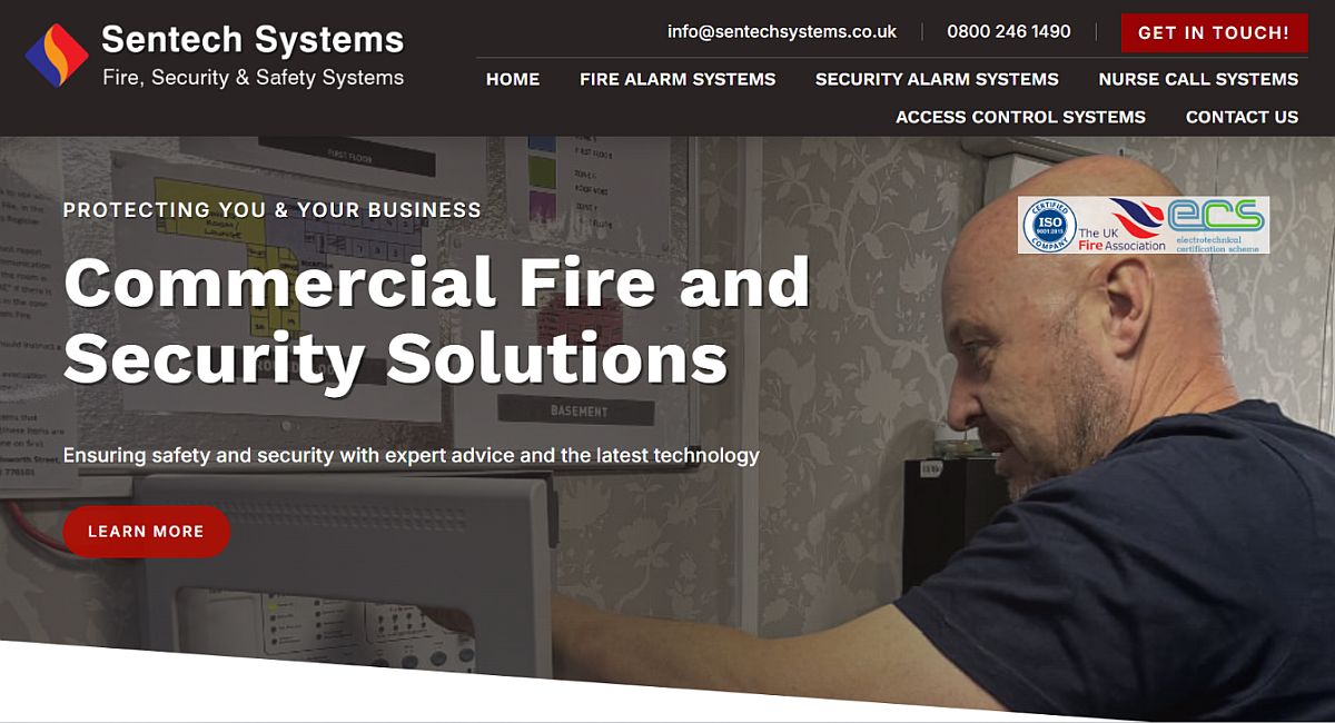
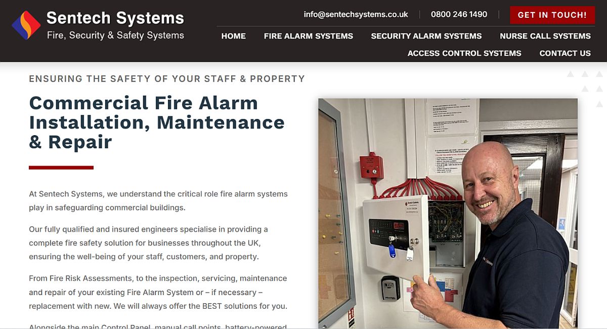
Like Martin’s website, the new Sentech Systems site has more of a traditional, corporate feel in order to match the expectations of its core client base.
Red is a popular colour for companies in the Fire & Security Systems industry – and it’s also in Sentech Systems logo – but I chose a dark grey / charcoal colour to go alongside this as I thought it made the ‘brand’ look more professional and ‘higher-end’ than the majority of its competitors.
The navigation header section is “fixed” so that it remains at the top of the screen as the visitor scrolls down the page but the Menu runs onto two lines, which is a first for me!
I decided upon this because:
a) The page Titles are longer than on most sites so even though there are only five pages it would be hard to get them on one line
b) The business is looking to expand into other areas of the industry in the near future and so are wanting to add more pages soon, and
c) It’s nice to do something different! 🙂
As I’ve mentioned many time times before on previous Projects, (good quality) images play a vital role in how a website looks and how it presents the business to its visitor.
Websites in this industry sector are notorious for their poor and limited imagery and the business owners were the first to admit that they’d seen the images that had been used on their previous website on many of the competitor’s sites too!
Being able to get real people involved in the business rather than stock images of engineers from Poland and Lithuania makes such a dramatic difference!
Click here… to see the website live on your current device – and please do get in touch if I may be able to help with improving the performance of your website, or growing your business in any way.


